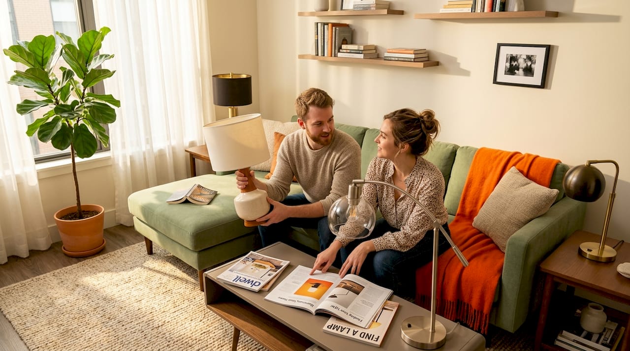
Sie haben gerade eine wunderschöne neue Lampe auf Ihrem Beistelltisch platziert, nur um festzustellen, dass etwas subtil nicht stimmt. Die Proportionen sind leicht falsch. Die Schirmfarbe beißt sich mit der Wand. Der Stil des Fußes scheint in ein völlig anderes Zuhause zu gehören. Diese nagende visuelle Dissonanz hat fast jeder Hausbesitzer schon einmal erlebt, und die Lösung ist nicht immer offensichtlich. Die Lampenstil-Abstimmung ist eine täuschend vielschichtige Fähigkeit, die Proportionen, Farbtheorie, Formenpsychologie und den Raumkontext zu einer einzigen bewussten Wahl verbindet. Es geht nicht nur darum, einen Raum zu beleuchten; es geht darum, eine Atmosphäre zu kuratieren, die Ästhetik zu verbessern und Ihr Zuhause wirklich *richtig* anfühlen zu lassen. Dieser umfassende Leitfaden entschlüsselt die wahren Regeln, erklärt die cleversten Ausnahmen und gibt Ihnen ein Raum-für-Raum-Handbuch an die Hand, um Ihr Zuhause mit echtem Selbstvertrauen und Flair zu beleuchten.
Inhaltsverzeichnis
- Was bedeutet Lampenstil-Abstimmung wirklich?
- Die neuen Regeln: Grundlagen von Größe und Proportion
- Wie man Formen, Farben und Muster wählt, die funktionieren
- Lampenstil-Abstimmung, Raum für Raum: Praktische Anwendungen
- Warum die meisten „Lampen-Abstimmungs“-Regeln dazu da sind, gebrochen zu werden
- Bereit, Ihre perfekte Lampe zu finden?
- Häufig gestellte Fragen
Wichtige Erkenntnisse
| Punkt | Details |
|---|---|
| Proportionsregeln beachten | Die klassische Faustregel hilft, aber passen Sie sie an ungewöhnliche Lampenformen an und berücksichtigen Sie die Gesamtgröße des Raumes. |
| Form und Muster ausbalancieren | Kontrastierende Basen und Schirme mit Mustern und Formen halten Räume visuell interessant und dynamisch. |
| Raumspezifische Logik anwenden | Wählen Sie Lampen basierend auf den einzigartigen Bedürfnissen, Stimmungen und funktionalen Anforderungen verschiedener Räume. |
| Flexibilität zulassen | Großartiger Lampenstil entsteht oft durch die Mischung etablierter Regeln mit Ihrem persönlichen Flair und einer Prise bewussten Regelbruchs. |
Was bedeutet Lampenstil-Abstimmung wirklich?
Nachdem wir nun dargelegt haben, warum die Lampenauswahl wichtig ist, wollen wir nun aufschlüsseln, was „Stil-Abstimmung“ in der Wohnraumbeleuchtung wirklich bedeutet. Es ist weit nuancierter, als nur etwas zu wählen, das „passt“.
Bei der Lampenstil-Abstimmung geht es nicht nur darum, eine Lampe zu finden, die zu Ihrem Sofa „passt“. Es geht darum, ein Gefühl visueller Harmonie zwischen dem Lampenfuß, dem Schirm und der gesamten Designsprache des Raumes zu erreichen. Stellen Sie sich das wie ein Dreiergespräch vor, bei dem jedes Element zur Gesamterzählung beiträgt. Der Fuß spricht den Stil Ihrer Möbel an und erdet das Stück. Der Schirm reagiert auf Ihre Farbpalette und Texturgeschichte, streut Licht und fügt Weichheit oder Struktur hinzu. Der Raum hält beide in einer lebendigen Komposition zusammen, in der die Lampe ein integraler Bestandteil der Erzählung wird, nicht nur ein nachträglicher Einfall.
Was dies knifflig macht, ist die Vielzahl visueller Variablen, die gleichzeitig im Spiel sind und jede eine sorgfältige Überlegung erfordert:
- Größe und Proportionen: Hat die Lampe die richtige Höhe und Breite im Verhältnis zum dazugehörigen Tisch, den Sitzgelegenheiten daneben und dem Gesamtvolumen des Raumes? Eine zu kleine Lampe kann verloren wirken, während eine zu große überwältigen kann.
- Formensprache: Spiegelt die Krümmung oder die Winkel der Lampe die Möbel wider oder kontrastiert sie bewusst damit? Wiederholung kann Ruhe schaffen, während ein wohlüberlegter Kontrast dynamisches Interesse wecken kann.
- Farbe und Ton: Harmonisiert die Lampe mit der bestehenden Farbpalette des Raumes und fügt sich nahtlos in den Hintergrund ein? Oder zieht sie als bewusster Akzent die Aufmerksamkeit auf sich, als unerwarteter Farbtupfer oder als erdendes Neutral?
- Textur und Material: Keramik, Messing, Leinen, Glas, Rattan, Holz, Beton – jedes Material trägt eine starke stilistische Identität und haptische Qualität. Eine elegante Metalllampe evoziert Modernismus, während ein gewebtes Rattan-Stück böhmischen Charme flüstert. Wie interagieren diese Texturen mit den anderen Materialien in Ihrem Raum?
- Muster: Ein gemusterter Schirm wirkt ganz anders vor einer schlichten Wand oder einem einfarbigen Sofa als in einem musterreichen Raum. Zu verstehen, wie Muster geschichtet werden, ist der Schlüssel zur Vermeidung visueller Unordnung.
„Ein Lampenschirm sollte korrekt zum Fuß passen, und Sie können Faustregeln sowie Form- und Musterkontrast verwenden, um das Paar harmonisch zu halten.“
Eine gut abgestimmte Lampe bewirkt etwas Bemerkenswertes. Sie wird nicht mehr bewusst wahrgenommen, sondern wird zu einem stillen, kraftvollen Beitrag zum emotionalen Register des Raumes. Sie verleiht Wärme, Tiefe und ein Gefühl der Vollständigkeit. Das ist das Ziel. Für einen tieferen Kontext, wie unterschiedliche Beleuchtung für Einrichtungsstile in verschiedenen Designkategorien funktioniert, lohnt es sich zu verstehen, wie Form und Funktion sich von Mid-Century Modern über Japandi bis hin zu maximalistischen Konzepten unterscheiden.
Die neuen Regeln: Grundlagen von Größe und Proportion
Nachdem wir verstanden haben, was Stil-Abstimmung bedeutet, wollen wir uns nun praktisch damit beschäftigen, wie man Lampen und Schirme richtig dimensioniert. Proportion ist der Eckpfeiler des Lampen-Stylings und auch das am häufigsten missverstandene Element. Die meisten Menschen wählen einen Schirm instinktiv und enden mit etwas, das entweder den Fuß ertränkt oder wie ein winziger, schlecht sitzender Hut darauf thront. So gehen Sie bewusst vor.
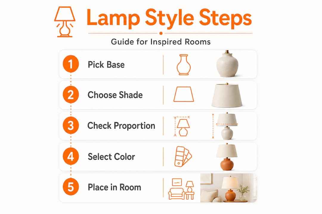
Die klassische Faustregel:
Der untere Durchmesser des Schirms sollte ungefähr der Höhe des Lampenfußes entsprechen. Wenn Ihr Fuß also 12 Zoll hoch ist, suchen Sie nach einem Schirm mit einer unteren Breite von etwa 12 Zoll. Dies erzeugt eine visuell ausgewogene Silhouette, die aus der Ferne proportional wirkt. Diese Regel stellt sicher, dass die Lampe geerdet und stabil aussieht und verhindert, dass sie kopflastig oder dünnbeinig wirkt.
Daran anschließend, hier ein einfacher nummerierter Rahmen für die Bestimmung der Schirmgröße:
- Messen Sie Ihren Lampenfuß: Beginnen Sie vom unteren Ende des Fußes bis knapp unterhalb der Lampenfassung. Dies ist Ihre Fußhöhe.
- Bestimmen Sie die Zielschirmbreite: Verwenden Sie diese Fußhöhe als Ihr anfängliches Ziel für den breitesten Punkt des Schirms (normalerweise der untere Durchmesser).
- Berücksichtigen Sie die Schirmhöhe: Die Höhe des Schirms sollte im Allgemeinen ein Drittel bis die Hälfte der Höhe des Fußes betragen. Dies verhindert, dass der Schirm im Vergleich zum Fuß zu gedrungen oder zu hoch wirkt.
- Überprüfen Sie den Glühbirnenabstand: Stellen Sie sicher, dass die Unterkante des Schirms unterhalb der Glühbirnenfassung sitzt, um freiliegende Hardware und eine unschöne Blendung zu vermeiden. Die Lichtquelle sollte vollständig im Schirm enthalten sein und das Licht nach unten und außen lenken.
- Sorgen Sie für Belüftung: Bestätigen Sie, dass die obere Öffnung des Schirms eine ausreichende Wärmeableitung ermöglicht, insbesondere bei herkömmlichen Glühlampen, obwohl dies bei modernen LEDs weniger kritisch ist.
Nun wird die reale Anwendung interessant. Die klassische Regel gilt nur für mittelgroße Füße. Größe und Proportionen werden weitaus nuancierter, wenn Sie mit extremen Silhouetten arbeiten. Ein sehr schlanker, säulenförmiger Fuß, der von einem breiten Schirm überwältigt wird, wirkt komisch kopflastig. Umgekehrt sieht ein gedrungener, breiter Urnenfuß, gepaart mit einem schmalen Schirm, ebenso unbeholfen aus, fast so, als würde der Fuß unter einem winzigen Kegel ächzen. Für allgemeinere Hinweise zur Lampendimensionierung ziehen Sie die Erkenntnisse von Designexperten zur Wahl einer Tischlampe, die zu Ihrem Raum passt, in Betracht.
| Lampenfußtyp | Empfohlene Schirmbreite | Am besten geeignete Schirmform | Warum es funktioniert |
|---|---|---|---|
| Schlanke Säule | Schmaler als Standard (z.B. 0,75x Fußhöhe) | Empire oder Trommel, kleiner Durchmesser | Behält die elegante, längliche Silhouette bei; vermeidet Kopflastigkeit. |
| Mittlere Urne oder Vase | Gleich der Fußhöhe (klassische Regel) | Trommel, Glocke oder Empire | Klassisches Gleichgewicht; vielseitig für verschiedene Stile. |
| Breites, gedrungenes Gefäß | Breiter als Standard (z.B. 1,25x Fußhöhe) | Breite Trommel oder flaches Empire | Gleicht das visuelle Gewicht des Fußes aus; verhindert einen „Hut“-Effekt. |
| Hohe, eckige geometrische Form | Mittlere Breite (proportional zum breitesten Punkt des Fußes) | Geometrischer oder eckiger Schirm (z.B. quadratisch, rechteckig) | Spiegelt die Linien des Fußes für einen kohärenten modernen Look wider. |
| Organisch/skulptural | Proportional zur Fußmasse; oft etwas breiter | Einfache Trommel, um den Fuß zum Star zu machen | Ermöglicht es dem künstlerischen Fuß, der Mittelpunkt zu sein, ohne Konkurrenz. |
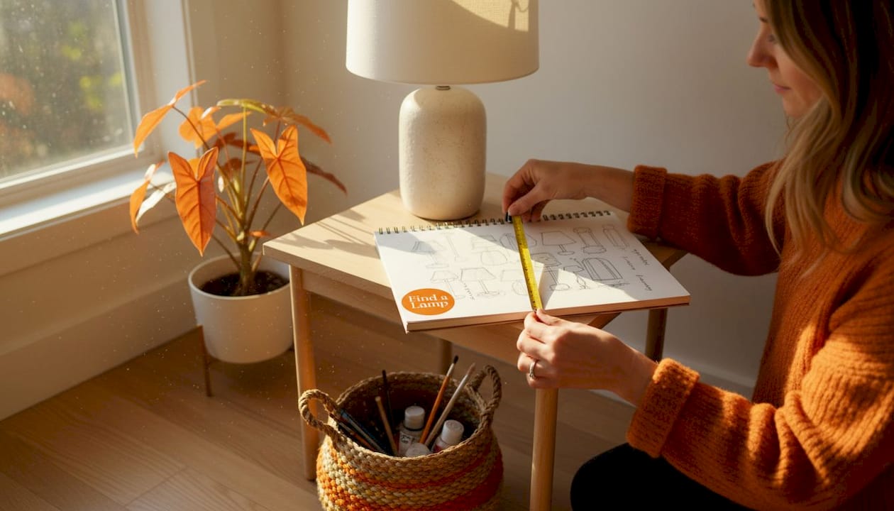
Profi-Tipp: Bringen Sie beim Einkaufen im Geschäft ein Maßband mit. Beim Online-Shopping skizzieren Sie Ihre Fußmaße auf Papier neben einer gedruckten Schirmkontur oder verwenden Sie Kreppband auf Ihrem Tisch, um die Stellfläche des Schirms zu visualisieren. Dieser visuelle Test erkennt Proportionsfehler, bevor Sie sich festlegen. Denken Sie daran, das Ziel ist immer visuelle Harmonie, nicht strikte Einhaltung einer einzelnen Zahl.
Der Geist der Wahl der richtigen Lampe ist immer das Zusammenspiel von Leuchte und Raum, daher behandeln Sie keine Regel als absolut. Betrachten Sie diese Richtlinien als Ihren Ausgangspunkt und vertrauen Sie Ihrem Auge, wenn die Zahlen in der Praxis leicht daneben liegen.
Wie man Formen, Farben und Muster wählt, die funktionieren
Die Beherrschung der Proportionen ist nur ein Teil der Geschichte. Als Nächstes kommt die Kunst, Formen, Farben und Muster auszuwählen, die Ihre Lampe wirklich aufregend machen, anstatt nur korrekt. Hier glänzen Persönlichkeit und Designabsicht wirklich.
Formkontrast ist Ihr Freund. Eine der dynamischsten und oft unterschätzten Strategien im Lampen-Styling ist der bewusste Formkontrast. Ein runder, organischer Schirm auf einem scharf geometrischen Fuß erzeugt visuelle Spannung auf die beste Art und Weise. Er hält das Auge gefesselt, ohne Chaos zu verursachen. Zum Beispiel schafft die Kombination eines eleganten, zylindrischen Metallsockels mit einem weichen, runden Leinen-Trommelschirm ein schönes Zusammenspiel von hart und weich. Umgekehrt kann die Kombination eines quadratischen Schirms mit einem quadratischen Sockel starr und übermäßig abgestimmt wirken, wie das Tragen eines perfekt monochromen Outfits, dem es an Persönlichkeit mangelt. Obwohl manchmal für minimalistische Räume beabsichtigt, kann es oft steril wirken.
Hier sind die wichtigsten Form-Kombinationsstrategien, die es wert sind, experimentiert zu werden:
- Runder Trommelschirm auf einem rechteckigen oder eckigen Fuß: Weich trifft auf strukturiert und schafft einen angenehmen visuellen Dialog.
- Glockenschirm auf einem skulpturalen organischen Fuß: Beide Kurven, aber mit unterschiedlichen Rhythmen, sodass jede Form gewürdigt werden kann.
- Empire-Schirm auf einem hohen, schlanken Kerzenständerfuß: Eine klassische und elegante Harmonie, die zeitlos wirkt.
- Geometrischer Schirm auf einem einfachen zylindrischen Fuß: Der Schirm wird zum primären Statement und verleiht einem minimalistischen Fuß eine architektonische Note.
- Ovaler Schirm mit einem ovalen oder rechteckigen Tisch: Spiegelt die Form des Tisches wider, ohne eine exakte Übereinstimmung zu sein, und bietet subtile Kohäsion.
Farbabstimmung: Harmonie versus Kontrast. Die Wahl der Schirmfarbe ist der Punkt, an dem viele Menschen entweder übermäßig abstimmen oder zu wenig nachdenken. Die beiden Hauptansätze sind analoge Harmonie und bewusster Kontrast. Bei der analogen Harmonie wählen Sie einen Schirm in einer Farbfamilie, die bereits in Ihrem Raum vorhanden ist. Ein warmer Cremeschirm vor taupefarbenen Wänden und honigfarbenen Holzmöbeln ist ein klassisches Beispiel. Nichts stört. Alles atmet und trägt zu einer ruhigen, kohärenten Atmosphäre bei. Dieser Ansatz eignet sich hervorragend, um eine ruhige, raffinierte Kulisse zu schaffen.
Kontrast, wenn er bewusst eingesetzt wird, ist weitaus aufregender. Ein tief waldgrüner Schirm in einem neutralen Raum mit weißen Wänden und hellen Eichenmöbeln wird zu einem verankernden Akzent. Er kämpft nicht mit dem Raum; er gibt ihm einen Blickfang, zieht das Auge an und fügt Tiefe hinzu. Hier können Sie Persönlichkeit einbringen und ein Statement setzen. Der Schlüssel ist sicherzustellen, dass die Kontrastfarbe auch an anderer Stelle im Raum vorhanden ist, selbst in einem kleinen Detail wie einem Zierkissen oder einem Kunstwerk, um alles miteinander zu verbinden. Für Tipps, wie Sie Farben und Texturen in Ihrem Zuhause effektiv schichten können, schauen Sie sich Ressourcen wie The Spruce's Leitfaden zum Mischen und Anpassen von Mustern an.
Muster: Bitte eins nach dem anderen. Die sicherste und effektivste Regel für Muster lautet: Wenn Ihr Schirm gemustert ist, halten Sie den Fuß schlicht und umgekehrt. Ein reich texturierter Keramikfuß hat bereits eine visuelle Komplexität; ein schlichter weißer Trommelschirm lässt ihn atmen und zum Star werden. Ein bedruckter botanischer Schirm hingegen glänzt am hellsten, wenn er mit einem matten, einfarbigen Fuß in einer der Akzentfarben des Drucks kombiniert wird. Dieser Ansatz verhindert eine visuelle Überladung und stellt sicher, dass jedes Element gewürdigt werden kann.
Für Räume, die zu einer kühnen, geschichteten Beleuchtung für jeden Stil neigen, können Muster gestapelt werden, aber nur, wenn es einen klaren Hauptdarsteller und einen klaren Nebendarsteller gibt. Stellen Sie es sich wie Musik vor: eine Melodie, eine Harmonie, nicht zwei Melodien, die um Aufmerksamkeit kämpfen. Zum Beispiel könnte ein subtil texturierter Fuß einen Schirm mit einem komplizierteren Muster unterstützen, oder ein kühner geometrischer Fuß könnte mit einem Schirm mit einem zarten, abstrakten Druck kombiniert werden. Wenn Sie die Idee einer ausdrucksstarken, visuell reichen Tischlampe lieben, aber nicht wissen, wo Sie anfangen sollen, kann das Stöbern in künstlerischen Tischlampen Ideen dazu liefern, wie kühne Basen und nuancierte Schirme in kuratierten Umgebungen wunderschön interagieren.
Profi-Tipp: Im Zweifelsfall bei der Farbwahl wählen Sie einen Schirm in einem Ton, der der zweit-prominentesten Farbe Ihres Raumes entspricht, anstatt der dominanten. Dies schafft eine Verbindung ohne Redundanz und verleiht der Lampe einen Sinn im Raum, indem sie subtile Tiefe hinzufügt. Berücksichtigen Sie auch die lichtfilternden Eigenschaften: Ein dunkler Schirm erzeugt ein dramatischeres, fokussierteres Licht, während ein heller Schirm das Licht breiter streut.
Lampenstil-Abstimmung, Raum für Raum: Praktische Anwendungen
Mit den Stilprinzipien in der Hand sind Sie bereit, Lampen-Abstimmungstechniken in jedem Raum Ihres Hauses anzuwenden. Da jeder Raum eine andere Funktion hat, ändern sich die visuellen und praktischen Anforderungen an Lampen von Raum zu Raum erheblich. Die Anpassung Ihrer Beleuchtung an jeden Raum gewährleistet sowohl Schönheit als auch Funktionalität.
Wohnzimmer sind Orte, an denen Lampen wirklich glänzen können, indem sie sowohl Umgebungs- als auch Arbeitsbeleuchtung bieten. Dies ist der Raum für Statement-Basen, ausdrucksstarke Schirme und Lampen, die einen zweiten Blick verdienen. Größere Lampen mit großzügigen Proportionen fühlen sich hier am wohlsten, insbesondere Stehlampen neben Sofas und stattliche Tischlampen, die Konsolen oder Beistelltische flankieren. Berücksichtigen Sie die Höhe Ihrer Möbel; der untere Rand eines Tischlampenschirms sollte idealerweise auf Augenhöhe sein, wenn Sie sitzen, um Blendung zu vermeiden. Die Lampenauswahl für das Wohnzimmer neigt dazu, sich auf Stücke zu konzentrieren, die die Stilgeschichte des Raumes verankern, sei es ein skulpturaler Keramikfuß in einem modernen Ambiente oder eine säulenförmige Lampe mit Messing-Finish in einem traditionelleren Layout. Für eine gehobene, raffinierte Interpretation dieses Raumes zeigt die Erkundung der modernen Wohnzimmerbeleuchtung, wie viel Vielfalt innerhalb einer einzigen Stilrichtung existiert.
Schlafzimmer verlangen etwas Ruhigeres, Intimeres und auf Entspannung Ausgerichtetes. Lampen hier müssen warmes, diffuses Licht liefern, das das Abschalten fördert, anstatt die Sinne zu aktivieren. Proportional sollten Nachttischlampen mit ihrem Schirmboden etwa auf Schulterhöhe sitzen, wenn Sie aufrecht im Bett sitzen. Das hält das Licht nach unten gerichtet, anstatt beim Lesen in der Nacht in Ihre Augen zu blenden. Für die Schlafzimmer-Stil-Abstimmung sind weichere Materialien führend. Leinenschirme, mattierte Glasfüße und matte Keramikoberflächen tragen alle zum Gefühl der Ruhe bei. Der Schlafzimmerbeleuchtungs-Leitfaden bietet wunderschön kuratierte Optionen, die zeigen, wie subtile, wohlproportionierte Lampen einen Schlafbereich in etwas wirklich Erholsames verwandeln.
Büros und Leseecken sind die funktionsorientiertesten Zonen. Hier verlagert sich die Priorität auf die Arbeitsbeleuchtung: gezielte, blendfreie Beleuchtung, die die Konzentration unterstützt, ohne die Augen zu überanstrengen. Dies ist nicht der Ort für einen breiten, diffusen Trommelschirm. Ein gerichteterer Schirm mit einem leicht opaken Futter, oft in konischer oder Glockenform, funktioniert besser, da er das Licht auf die Arbeitsfläche konzentriert. Verstellbare Schreibtischlampen mit Gelenkarmen sind oft ideal. Materialwahlen wie Metall, gebürstete Oberflächen oder dunkle, einfarbige Farben helfen, die Lampe in einer funktionalen Ästhetik zu verankern.
Essbereiche verlassen sich oft auf Deckenleuchten, aber Stehlampen oder Buffetlampen können entscheidendes Umgebungslicht und Atmosphäre hinzufügen. Eine hohe Stehlampe in einem Esszimmer sollte die Größe Ihres Esstisches und Ihrer Stühle ergänzen und eine weiche, indirekte Beleuchtung bieten, die Gespräche und Atmosphäre verbessert, ohne zu hell zu sein. Buffetlampen auf einem Sideboard bieten eine symmetrische, elegante Note, oft mit Empire-