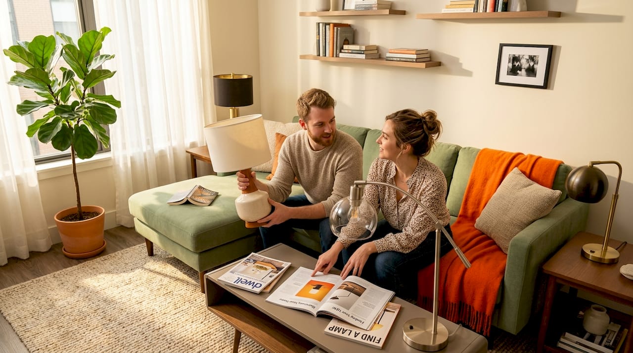
You’ve just set a beautiful new lamp on your side table, only to realize something feels subtly off. The proportions are slightly wrong. The shade color fights with the wall. The base style seems to belong in a completely different home. That nagging visual dissonance is something almost every homeowner has experienced, and the fix is not always obvious. Lamp style matching is a deceptively layered skill, one that blends proportion, color theory, shape psychology, and room context into a single deliberate choice. It's not just about illuminating a space; it's about curating an atmosphere, enhancing aesthetics, and making your home truly *feel* right. This comprehensive guide breaks down the real rules, explains the smartest exceptions, and gives you a room-by-room playbook to light your home with genuine confidence and flair.
Table of Contents
- What does lamp style matching really mean?
- The new rules: Size and proportion fundamentals
- How to pick shapes, colors, and patterns that work
- Lamp style matching, room by room: Practical applications
- Why most “lamp matching” rules are meant to be broken
- Ready to find your perfect lamp?
- Frequently asked questions
Key Takeaways
| Point | Details |
|---|---|
| Follow proportion rules | The classic thumb rule helps, but adjust for unusual lamp shapes and consider the entire room's scale. |
| Balance shape and pattern | Contrasting bases and shades with patterns and shapes keeps rooms visually interesting and dynamic. |
| Apply room-specific logic | Choose lamps based on the unique needs, moods, and functional requirements of different rooms. |
| Embrace flexibility | Great lamp style often comes from blending established rules with your own personal flair and a dash of intentional rule-breaking. |
What does lamp style matching really mean?
Now that we’ve set the stage for why lamp choices matter, let’s break down what “style matching” really means in home lighting. It’s far more nuanced than just picking something that “works.”
Lamp style matching is not simply about finding a lamp that “goes with” your sofa. It’s about achieving a sense of visual harmony between the lamp’s base, its shade, and the entire room’s design language. Think of it as a three-way conversation where each element contributes to the overall narrative. The base speaks to your furniture style, grounding the piece. The shade responds to your color palette and texture story, diffusing light and adding softness or structure. The room holds both together in a living composition, where the lamp becomes an integral part of the narrative, not just an afterthought.
What makes this tricky is how many visual variables are in play simultaneously, each demanding a thoughtful consideration:
- Scale and proportion: Is the lamp the right height and width relative to its accompanying table, the seating beside it, and the overall volume of the room? An undersized lamp can look lost, while an oversized one can overwhelm.
- Shape language: Do the curves or angles of the lamp echo or intentionally contrast with the furniture? Repetition can create calm, while judicious contrast can add dynamic interest.
- Color and tone: Does the lamp harmonize with the room’s existing palette, blending seamlessly into the background? Or does it pull focus as a deliberate accent, a pop of unexpected color or a grounding neutral?
- Texture and material: Ceramic, brass, linen, glass, rattan, wood, concrete – each material carries a strong stylistic identity and tactile quality. A sleek metal lamp evokes modernism, while a woven rattan piece whispers bohemian charm. How do these textures interact with the other materials in your space?
- Pattern: A patterned shade reads very differently against a plain wall or solid-colored sofa than it does in a pattern-rich room. Understanding how patterns layer is key to avoiding visual clutter.
“A lampshade should relate correctly to the base, and you can use rules of thumb plus shape and pattern contrast to keep the pair harmonious.”
A well-matched lamp does something remarkable. It stops being something you consciously notice and instead becomes a quiet, powerful contributor to the room’s emotional register. It adds warmth, depth, and a sense of completeness. That’s the goal. For deeper context on how different lighting for interior styles operates across design categories, it’s worth understanding how form and function differ from mid-century modern to Japandi to maximalist schemes.
The new rules: Size and proportion fundamentals
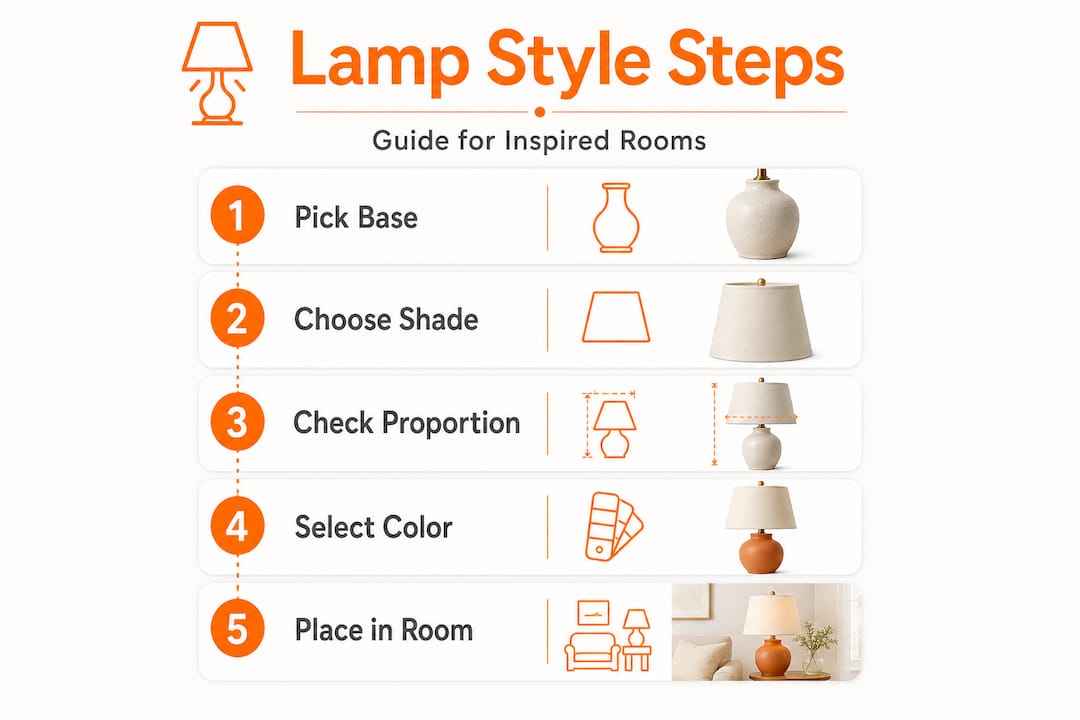
Having grasped what style matching means, let’s get practical with how to size lamps and shades the right way. Proportion is the cornerstone of lamp styling, and it’s also the most commonly misunderstood element. Most people choose a shade by instinct and end up with something that either drowns the base or perches on it like a tiny, ill-fitting hat. Here is how to approach it with intention.
The classic rule of thumb:
The shade’s bottom diameter should be roughly equal to the height of the lamp base. So if your base measures 12 inches tall, look for a shade with a bottom width of approximately 12 inches. This creates a visually balanced silhouette that feels proportional from across a room. This rule ensures the lamp looks grounded and stable, preventing it from appearing top-heavy or spindly.
Following that, here is a simple numbered framework for working through shade sizing:
- Measure your lamp base: Start from the bottom of the base to just below the light fitting (socket). This is your base height.
- Determine target shade width: Use that base height number as your initial target for the shade's widest point (usually the bottom diameter).
- Consider shade height: The shade’s height should generally be one-third to one-half of the base’s height. This prevents the shade from looking too squat or too tall compared to the base.
- Check bulb clearance: Make sure the shade’s bottom edge sits below the bulb fitting (socket) to avoid exposed hardware and an unsightly glare. The light source should be entirely contained within the shade, directing light downwards and outwards.
- Ensure ventilation: Confirm the shade’s top opening allows adequate heat ventilation, especially for traditional incandescent bulbs, though less critical with modern LEDs.
Now, here is where real-world application gets interesting. The classic rule only holds for medium-proportioned bases. Size and proportion becomes far more nuanced when you’re working with extreme silhouettes. A very skinny, column-style base overwhelmed by a wide shade looks comically top-heavy. Conversely, a squat, wide urn base paired with a narrow shade looks equally awkward, almost like the base is straining under a tiny cone. For more general guidance on lamp sizing, consider insights from design experts on how to choose a table lamp that fits your space.
| Lamp base type | Recommended shade width | Shade shape that works best | Why it works |
|---|---|---|---|
| Slender column | Narrower than standard (e.g., 0.75x base height) | Empire or drum, small diameter | Maintains elegant, elongated silhouette; avoids top-heaviness. |
| Medium urn or vase | Equal to base height (classic rule) | Drum, bell, or empire | Classic balance; versatile for various styles. |
| Wide, squat jar | Wider than standard (e.g., 1.25x base height) | Wide drum or shallow empire | Balances the base's visual weight; prevents a "hat" effect. |
| Tall, angular geometric | Medium width (proportional to base's widest point) | Geometric or angular shade (e.g., square, rectangular) | Echoes base's lines for cohesive modern look. |
| Organic/sculptural | Proportional to base mass; often slightly wider | Simple drum to let base star | Allows the artistic base to be the focal point without competition. |
Pro Tip: When shopping in person, bring a tape measure. When shopping online, sketch your base dimensions on paper next to a printed shade outline or use masking tape on your table to visualize the shade's footprint. That visual test catches proportion mismatches before you commit. Remember, the goal is always visual harmony, not strict adherence to a single number.
The spirit of choosing the right lamp is always about the interplay between fixture and space, so never treat any rule as absolute. Treat these guidelines as your starting point, and trust your eye when the numbers feel slightly off in practice.
How to pick shapes, colors, and patterns that work
Mastering proportion is only part of the story. Next comes the art of selecting shapes, colors, and patterns that make your lamp genuinely exciting rather than merely correct. This is where personality and design intention truly shine.
Shape contrast is your friend. One of the most dynamic and often underused strategies in lamp styling is deliberate shape contrast. A round, organic shade on a sharply geometric base introduces visual tension in the best way. It keeps the eye engaged without creating chaos. For instance, pairing a sleek, cylindrical metal base with a soft, round linen drum shade creates a lovely interplay of hard and soft. Conversely, pairing a square shade with a square base can feel rigid and overly matched, like wearing a perfectly monochromatic outfit that lacks personality. While sometimes intentional for minimalist spaces, it can often feel sterile.
Here are the core shape-pairing strategies worth experimenting with:
- Round drum shade on a rectangular or angular base: Soft meets structured, creating a pleasing visual dialogue.
- Bell shade on a sculptural organic base: Both curves, but with different rhythms, allowing each form to be appreciated.
- Empire shade on a tall, slender candlestick base: A classic and elegant harmony that feels timeless.
- Geometric shade on a simple cylindrical base: The shade becomes the primary statement, adding an architectural touch to a minimalist base.
- Oval shade with an oval or rectangular table: Echoes the table's shape without being an exact match, offering subtle cohesion.
Color matching: harmony versus contrast. Choosing shade color is where many people either over-match or under-think. The two main approaches are analogous harmony and deliberate contrast. With analogous harmony, you pick a shade in a color family that already exists in your room. A warm cream shade against taupe walls and honey-wood furniture is a classic example. Nothing jars. Everything breathes, contributing to a serene, cohesive atmosphere. This approach is excellent for creating a calm, sophisticated backdrop.
Contrast, when done with intention, is far more exciting. A deep forest-green shade in a neutral room with white walls and light oak furniture becomes an anchoring accent. It doesn’t fight the room; it gives it a focal point, drawing the eye and adding depth. This is where you can inject personality and make a statement. The key is to ensure the contrasting color is present elsewhere in the room, even in a small detail like a throw pillow or a piece of art, to tie it all together. For tips on how to effectively layer colors and textures in your home, check out resources like The Spruce's guide on mixing and matching patterns.
Patterns: one at a time, please. The safest and most effective rule for patterns is this: if your shade is patterned, keep the base plain, and vice versa. A richly textured ceramic base already has visual complexity built in; a plain white drum shade lets it breathe and be the star. A printed botanical shade, by contrast, shines brightest when paired with a matte, solid-color base in one of the print’s accent colors. This approach prevents visual overload and ensures each element can be appreciated.
For rooms that lean toward bold, layered lighting for every style, patterns can stack, but only when there’s a clear dominant and a clear supporting player. Think of it like music: one melody, one harmony, not two melodies fighting for attention. For example, a subtly textured base might support a shade with a more intricate pattern, or a bold geometric base could be paired with a shade featuring a delicate, abstract print. If you love the idea of an expressive, visually rich table lamp but aren’t sure where to begin, browsing artistic table lamps can spark ideas about how bold bases and nuanced shades interact beautifully in curated settings.
Pro Tip: When in doubt about color, pull a shade in a tone that matches your room’s second-most-prominent color rather than its dominant one. This creates connection without redundancy and gives the lamp a sense of purpose in the space, adding subtle depth. Also, consider the light-filtering properties: a dark shade will create a more dramatic, focused light, while a light shade will diffuse light more broadly.
Lamp style matching, room by room: Practical applications
With style principles in hand, you’re ready to apply lamp matching techniques to every space in your home. Because each room has a different function, the visual and practical requirements for lamps shift significantly from space to space. Customizing your lighting for each room ensures both beauty and functionality.
Living rooms are where lamps can truly perform, offering both ambient and task lighting. This is the space for statement bases, expressive shades, and lamps that earn a second glance. Larger lamps with generous proportions tend to feel most at home here, particularly floor lamps alongside sofas and substantial table lamps flanking consoles or end tables. Consider the height of your furniture; the bottom of a table lamp shade should ideally be at eye level when you're seated, preventing glare. Living room lamp choices tend to lean toward pieces that anchor the room’s style story, whether that’s a sculptural ceramic base in a contemporary setting or a brass-finished column lamp in a more traditional layout. For an elevated, sophisticated take on this space, exploring modern living room lighting reveals just how much variety exists within a single style direction.
Bedrooms ask for something quieter, more intimate, and focused on relaxation. Lamps here need to deliver warm, diffused light that supports winding down rather than activating the senses. Proportionally, bedside lamps should sit with their shade bottom at roughly shoulder height when you’re seated upright in bed. That keeps the light directed downward rather than glaring into your eyes during a nighttime read. For bedroom style matching, softer materials lead the way. Linen shades, frosted glass bases, and matte ceramic finishes all contribute to the sense of calm. The bedroom lighting guide offers beautifully curated options that demonstrate how subtle, well-proportioned lamps transform a sleeping space into something genuinely restorative.
Offices and reading nooks are the most function-first zones. Here, the priority shifts to task lighting: targeted, glare-free illumination that supports focus without straining the eyes. This is not the place for a wide, diffusing drum shade. A more directional shade with a slightly opaque lining, often in a conical or bell shape, works better, concentrating light on the work surface. Adjustable desk lamps with articulated arms are often ideal. Material choices like metal, brushed finishes, or dark, solid colors help ground the lamp in a functional aesthetic.
Dining spaces often rely on overhead fixtures, but floor lamps or buffet lamps can add crucial ambient light and mood. A tall floor lamp in a dining room should complement the scale of your dining table and chairs, providing soft, indirect illumination that enhances conversation and atmosphere without being too bright. Buffet lamps on a sideboard offer a symmetrical, elegant touch, often with empire or bell shades that direct light gently. For more detailed room-by-room advice, consider insights from design publications like Homes & Gardens on choosing the right lamp for different spaces.
Entryways are your home's first impression. Lamps here should be welcoming and reflective of your overall style. A statement table lamp on a console or a pair of slender buffet lamps can provide a warm glow and a focal point. Consider the height of your console; the lamp should fill the vertical space without overpowering it. Sculptural bases, bold colors, or unique textures can make a strong style statement right at the door.
| Room | Ideal lamp height (Table/Floor) | Best shade style | Material mood | Key Function |
|---|---|---|---|---|
| Living room | Table: 24-32 inches; Floor: 58-64 inches total | Drum, empire, bell (diffused) | Ceramic, brass, glass, wood, textured fabrics | Ambient, accent, some task lighting |
| Bedroom | Nightstand: 24-27 inches total (shade bottom at shoulder height) | Linen drum or soft bell (diffused) | Linen, frosted glass, matte ceramic, soft metals | Ambient, task (reading), relaxation |
| Home office | Desk: 15-18 inches (adjustable) | Directional, opaque (cone, bell) | Metal, brushed finishes, dark wood | Task lighting, focused illumination |
| Dining space | Buffet: 28-34 inches; Floor: 60-68 inches total | Wide empire or coolie (warm fabric) | Warm fabric, rattan, glass, polished metals | Ambient, accent, mood setting |
| Entryway | Console: 28-34 inches; Floor: 60-68 inches total | Statement, sculptural (often drum or empire) | Bold ceramic, marble, dark wood, aged metals | Welcoming, accent, style statement |
The edge-case principle applies here too: an unusually narrow hallway, for example, calls for a slimmer lamp silhouette than a standard rule would suggest. Always read the room literally before applying any formula, considering not just the lamp itself, but its relationship to *everything* around it.
Why most “lamp matching” rules are meant to be broken
Here is our honest, hard-won perspective: the most visually stunning rooms we’ve ever encountered tend to share one feature in common. They’re curated, not coordinated. There’s a meaningful difference. Coordinated rooms look like they were assembled from a single catalog page—everything matches, everything is safe, and often, everything is a little bit boring. Curated rooms look like they were built by someone with genuine taste, real curiosity, and the confidence to put a matte black industrial lamp in a room full of velvet and antique wood.
Rigid matching creates a kind of visual silence that can easily tip into visual boredom. When every lamp shade echoes the curtain lining, when every base echoes the table legs, the room starts to feel like a showroom floor sample rather than a lived-in, loved space. Real homes thrive on layered, collected looks. They carry the fingerprints of their inhabitants, telling a story through their unique blend of styles and periods. As Architectural Digest notes about eclectic decor, the magic lies in harmonious contrasts.
What we’ve come to believe, after exploring thousands of lamp and room combinations, is that rules are most useful when you understand them well enough to break them deliberately. The designer who puts a dramatically oversized shade on a small sculptural base isn’t ignorant of proportion rules; they’re exploiting them for effect, creating a bold, whimsical statement. The homeowner who pairs a wild, patterned base with an equally expressive shade isn’t breaking the “one pattern at a time” guideline carelessly; they’re creating a maximalist focal point that the room was built to support, celebrating abundance and visual richness.
The better goal is not rule compliance. It’s visual confidence. And that comes from asking a different question: not “does this match?” but “does this feel right in my room, for how I live in it, and does it spark joy?” Let your lamps reflect how the space is actually used and what genuinely excites you aesthetically. Maybe that means a vintage lamp found at a flea market next to a brand-new minimalist sofa. Maybe it's a vibrant, unexpected color in a subdued room. These are the choices that make a home truly yours. Finding your own lighting style is ultimately a personal act, and no guideline should override the evidence of your own eyes and your heart's desire for a space that reflects you.
Ready to find your perfect lamp?
Inspired to bring fresh